
Xamarin.Froms: Styling
To recap, I’m writing a shopping cart app for Windows Phone, Android, and iOS. The purpose of the app is primarily to let me use Forms. Each post will build on top of the previous one.
Last time I added an dependency injection framework. This week I want to make the app look a little less blah so I’ll be adding themes and styling.
Recap and Code
This is the seventh post in the series, you can find the rest here:
- Day 0: Getting Started (blog / code)
- Day 1: Binding and Navigation (blog / code)
- Day 2: Frames, Event Handlers, and Binding Bugs (blog / code)
- Day 3: Images in Lists (blog / code)
- Day 4: Search and Barcode Scanner (blog / code)
- Day 5: Dependency Injection (blog / code)
- Day 6: Styling (blog / code)
- Day 7: Attached Behaviors (blog / code)
- Day 8: Writing to Disk (blog / code)
- Day 9: App and Action Bars (blog / code)
- Day 10: Native Views (blog / code)
For a full index of posts, including future posts, go to the GitHub project page.
Styling Options in XF
The guidance in Xamarin’s documentation is to create custom renders for each control you want to style for each platform. This seemed like an unintuitive and complicated way to go about solving the problem so I avoided trying it as long as possible.
@TheRealJoeRall suggested an interesting idea to try: use the native theming options from each platform. On WindowsPhone add styles with a TargetType but no key to the App.xaml. On Android create a theme in xml and apply it to the top level activity. On iOS use the UIAppearance class. Like the content render solution this approach requires writing a different theme for each platform, but it uses the native approach meaning that there will be more documentation and tooling around it. Now, let’s just hope it works.
Quick Reminder about iOS
Before I go any further, I want to put out a reminder that since I don’t have access to iOS these articles won’t cover it. Which means that I was unable to determine if the UIAppearance class would be able to help in styling a XF application.
Styling Windows Phone
There’s lots of documentation on how to style and theme a native Windows Phone app. Most of it written by people who know a lot more about the topic than I do. I’m going to keep mine to the basics.
The first thing to know is that any styles you create in the App.xaml file will be accessible from all of your content pages by default. But how do you create a style in the first place?
<Application>
  <Application.Resources>
    <ResourceDictionary>
      <Style TargetType="TextBlock" >
        <Setter Property="Foreground" Value="Black"/>
      </Style>
    </ResourceDictionary>
  </Application.Resources>
</Application>
Above is a very simple style that sets the Foreground of all TextBlocks to black. Again, this style can get much more complex, but I’ll leave it here for now.
You could make this an explicit style by giving it a key,
x:key=”BlackTextBlock” for example. This way it would only apply to TextBlocks
that specifically reference the style. But since all of our pages are
currently defined in the common Xamarin Forms layer, we don’t have TextBlocks
at all, and can’t reference explicit styles. So while explicit styles are
great when writing native Windows Phone pages, they are not very interesting in
XF.
Again, I could rant on this a lot longer, but I’m not the best source. My style for WP is quite long but not much more than a basic example, so I won’t bother with the snippet here. If you’re interested, you can view my full App.xaml on GitHub.
Limitations With Using Windows Phone Styling
My goal with the styling was to create a white background. I could not figure out a way to set the background color from within the Windows Phone project. I tried several techniques that did not work.
First, I tried explicitly setting the color in the MainPage.xaml (the following code is stripped down for size and clarity):
<phone:PhoneApplicationPage
    FontFamily="{StaticResource PhoneFontFamilyNormal}"
    FontSize="{StaticResource PhoneFontSizeNormal}"
    Foreground="{StaticResource PhoneForegroundBrush}"
    Background="White" />
This had no effect so I tried setting it programmatically in MainPage.xaml.cs. I tried setting both the MainPage background as well as the navigation page returned from the common layer. Neither worked, either separately or together. I’ll show them all at once.
public MainPage()
{
    this.Background = new System.Windows.Media.SolidColorBrush(System.Windows.Media.Colors.White);

    var startupPage = ShoppingCart.App.StartupPage;
    startupPage.BackgroundColor = Xamarin.Forms.Color.White;

    Content = startupPage.ConvertPageToUIElement(this);
}
Digging down into the child page of the navigation page did work, but that had two drawbacks. First it only worked for that one page, so I’d have to change the color of all the pages. Second, it pushed me up into the common layer. Since I was in the common layer anyway it would just be easier to set the background page color directly in the XAML definitions of the pages. This is ultimately what I did. Here’s an example from the Welcome page.
<ContentPage xmlns="http://xamarin.com/schemas/2014/forms"
             xmlns:x="http://schemas.microsoft.com/winfx/2009/xaml"
             x:Class="ShoppingCart.Views.WelcomePage"
             BackgroundColor="White" >
   <!-- Layout Removed -->
</ContentPage>
Note that I could have used Xamarin Form’s OnPlatform mechanism to selectively set the property only for Windows Phone. I elected not to since I did want the background to be white on all platforms anyway, even if I did not need to set the property explicitly for Android to work.
Styling Android
Android also has a very simple way to set the overall style for all Activities. They also have much better documentation than I could mimic. The key take away here is to define your android theme in an xml file in the values folder of your project. Then reference it in your AndroidManifest.xml file. The quickest way I’ve found to create a theme is to use the online Holo Colors Generator.
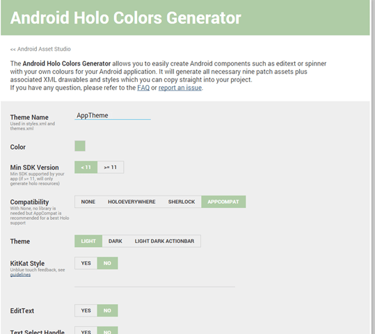
You just enter the color you want to use in your theme and tick off the checkboxes of the controls you want this theme to apply to. It generates a zip that you can extract directly into your resources directory. Just include all of the files and set your theme in the AndroidManifest like this where AppTheme is the the name of the theme in the themes_apptheme.xml file:
<application android:theme="@style/AppTheme" />
That’s it for styling droid. It’s pretty straight forward and took me about 15
minutes. The color I picked was a nice light green: #afcca6.
Problems with This Approach
One major limitation with this approach is that it treats all things equally All text boxes will look the same. If for example you wanted the text box at the top of the product page to be a color based on the theme, you can’t easily achieve that. You’d have to fallback to manually setting the various properties correctly on each page.
Solution 1: Theme Class
For this specific case, I created an interface IThemer with a default implementation that could be overriden for specific platforms. For now, the only property exposed is AccentColor, but it could be expanded to provide other style related properties.
public interface IThemer
{
    Color AccentColor { get; }
}

public class DefaultThemer : IThemer
{
    public Color AccentColor { get { return Color.Accent; } }
}

public class AppSetup
{
    protected virtual void RegisterDepenencies(ContainerBuilder cb)
    {
        // ... Code removed for clarity
        cb.RegisterType<DefaultThemer>().As<IThemer>().SingleInstance();
    }
}
Originally, the DefaultThemer I created just returned a randomly generated dark
color and the Windows Phone implementation overrode it with the AccentColor
pulled from the app’s resource dictionary. Then while playing around I found
the Xamarin.Forms.Color.Accent property. On Windows Phone this returns the
phone’s accent color. On Droid it returns black. This is great in that it
gets me half way there, but I want to use my nice light green color I defined
in my droid styles: #afcca6. So in the droid project I created an
implementation of IThemer and registered it with my dependency injection
container from last week:
public class DroidThemer : IThemer
{
    public DroidThemer()
    {
        var resources = Forms.Context.Resources;
        int colorId = Resource.Color.apptheme_color;
        var color = resources.GetColor(colorId);

        AccentColor = Color.FromRgba(color.R, color.G, color.B, color.A);
    }

    public Color AccentColor { get; private set; }
}

public class DroidSetup : AppSetup
{
    protected override void RegisterDepenencies(ContainerBuilder cb)
    {
        base.RegisterDepenencies(cb);

        cb.RegisterType<DroidLogger>().As<ILogger>().SingleInstance();
        cb.RegisterType<DroidScanner>().As<IScanner>().SingleInstance();
        cb.RegisterType<DroidThemer>().As<IThemer>().SingleInstance();
    }
}
The code grabs the color as it is defined in my app’s theme and sets the AccentColor property. Now if the color is ever changed in the theme, it will propagate to my special theming class. Again, I simply override the existing registration for the IThemer with the DroidThemer. AutoFac is smart enough to remove the prior registration made in AppSetup.
Now the question becomes, where do I put this class? I could make the BaseViewModel take an instance of it so that all of the views can easily know where to access it. I don’t like this for a number of reasons. First and foremost this is not view model information. It has nothing to do with the state of the app or data, it’s purely view. Secondly, adding constructor parameters on a base class is a headache to mange long term, especially when you wind up having a lot of inheriting classes. You need to touch each child class whenever those parameters change. This is definitely not the solution for me.
My second idea was to expose the AccentColor property on the App class. This really is a system wide app setting so the App class does make a certain amount of sense. Besides, all of my views are already aware of it since that’s where they are getting their view models. Also, it’s really quick to add it in this one place. It’s not an ideal solution since I’m trying to NOT have App turn into a dumping ground for properties (hence my clean up last week) but it’s so quick and easy now, that I’ll go with it.
public static class App
{
    private static IContainer _container;

    public static void Init(AppSetup appSetup)
    {
        _container = appSetup.CreateContainer();
        AccentColor = _container.Resolve<IThemer>().AccentColor;
    }

    public static Color AccentColor { get; private set; }
}
The init method pulls out the IThemer implementation and grabs the AccentColor from it. After this I bind to the property from within the WelcomePage.
<Label Text="Welcome to The Store"
       Font="Bold, Large"
       HorizontalOptions="Center"
       TextColor="{x:Static local:App.AccentColor}" />
I only used this solution in one place: WelcomePage. While it is good for keeping all of the style definitions in one place I really only had one style that I wanted to use: accent color. As it turned out Xamarin already did most of the heavy lifting for me. Isn’t that always the case?
Solution 2: Color.Accent and OnPlatform
After finding out that I could just use the Color.Accent static color (I really did find that very late in the game), I realized that there was a much simpler way to solve the problem. On platforms that support the Color.Accent, use it, on other platforms use my alternate color. This is easy to accomplish with the OnPlatform class. Here’s an example from my ProductsPage:
<Label Text="{Binding Product.Name}"
       HorizontalOptions="Center"
       Font="Bold,Large">
  <Label.TextColor>
    <OnPlatform x:TypeArguments="Color"
                iOS="Accent"
                WinPhone="Accent"
                Android="#afcca6" />
  </Label.TextColor>
</Label>
On WinPhone and iOS, the Accent color is used. On Droid, I fallback to my custom light green color.
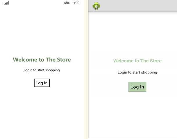
Pics or It Didn’t Happen
I was mostly concerned with the how-to aspect of this write up and avoided screen shots throughout the post. But, now that the post is over, here’s what the app looks like after my styling efforts.
Welcome Screen
Categories Screen
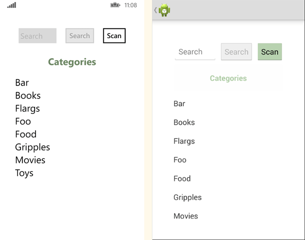
It’s starting to look just a little more polished.
Happy Coding.
this post was originally on the MasterDevs Blog