
Headers and Footers on an MvxListView
Full source for this post can be found on GitHub: HeaderedGridView
Last week I posted about adding a header to a GridView. Today I’ll be discussing how to add a header (and footer!) to a MvxListView. The MvxListView is a data-binding friendly ListView from MvvmCross. Adding a header here is a little different because we need an instance of HeaderViewListAdapter that implements IMvxAdapter . Other than that, the code should be very familiar.
Requirements
Just so it is clear what we are building, here are my requirements for this control:
- Ability to add a header and footer to the MvxListView in xml markup
- The header is to be laid out inline with the rest of the items, at the top
- The footer is to be laid out inline with the rest of the items, at the bottom
- The header and footer need to scroll with the rest of the content, i.e., they are not always visible
- The header and footer must be able to use MvvmCross bindings
- Some quick screenshots from the sample project will help us understand what this should look like.
 The list is scrolled to the top with purple header visible
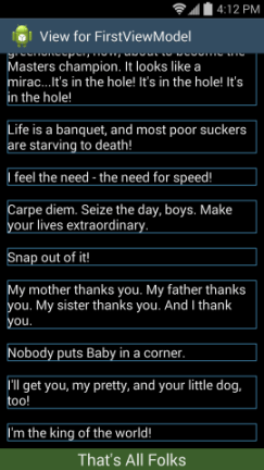
 Shows the list at some point in the middle when neither header nor footer is visible
 The list scrolled all the way to the bottom with the green footer visible
Code
Full source for this post can be found on GitHub: HeaderedGridView
The MvxListView assumes that the adapter it has implements IMvxAdapter. We can create a simple wrapper class that inherits from HeaderViewListAdapter and implements that interface. The constructor will accept the list of headers and footers like the base class in addition to accepting an IMvxAdapter to wrap. All of the interface methods for IMvxAdapter can then be passed down to the internal adapter.
In the snippet of HeaderMxAdapter above we have two constructors. The first can be used if you do not want to add a footer. It simply calls into the second passing an empty list of footers to add to the adapter. The only other thing the constructor does is to squirrel away the adapter in a private field for later use.
The implementation for DropDownItemTemplateId is simple and indicative of the rest of the methods in the class. It merely calls into that squirreled away adapter, calling its implementation of DropDownItemTemplateId. The rest of the methods are exactly the same and have been omitted for brevity.
Next step is to add a pair of attributes to use for our header and footer. This is exactly the same as the headered grid view and is done in attrs.xml.
Some boiler-plate code in MvxListViewWithHeader will read these values so we know what views to use for the header and footer. Like last time, I’m using some helper classes to do the parsing. They are included in the project.
Next we need to create the views for the header and footer.
First we check if the id is the default header id, if it is then we don’t have a view defined in the xml, and we just return null. After that we get the current binding context and use it to inflate our view. This is the magic that lets us bind within our header and footer.
Once we have the view, we need to wrap it in a list of FixedViewInfo which is what the HeaderMxAdapter expects in its constructor.
Nothing earth shattering here. If the view is null, return an empty list, otherwise construct the FixedViewInfo and add it to the list. Returning an empty list allows us to specify only the header, only the footer, or neither without causing any errors.
A couple of helper methods make help to make it clear and concrete what GetFixedViewInfos does.
All of this is called from the constructor which creates the MvxAdapter and wraps it in our new HeaderMvxAdapter. It then set the adapter property in the base class.
The constructor is also responsible for reading in the item template id which the MvxListView uses to display the individual items in the list.
Using the Control
You would use the MvxListViewWithHeader the same way as a MvxListView. The only difference is that you can now optionally specify a header or footer attribute which would point to another layout. The following is taken from the FirstView in the sample.
The header and footer layout in the sample are very simple. They are just a TextView with the text property bound to the view model. Here is the header layout, but the footer is almost identical.
Future Improvements
Like the headered grid view, this implementation only allows a single header. If we had need for multiple headers we could copy the onFinishedInflate method from ListView. It collects all the child layouts for the list view and adds them to the list of headers.
Happy Coding
this post was originally on the MasterDevs Blog